From “Cloud Dancer” : One more year, Pantone has unveiled its Colour of the Year for 2026 — and the choice couldn’t be more straightforward. The chosen colour, “Cloud Dancer,” is a very light off-white with a creamy texture of what looks like whipped vanilla, quite far from a marshmallow you would expect from a trend-setting colour but rather from the inside of a marshmallow. However, might a colour this neutral actually mirror the worldwide mood?
Colour-science professor Stephen Westland of the University of Leeds doesn’t seem to be convinced. He considers “colour of the year” statements as “a marketing trick rather than a serious cultural indicator.” Although Pantone might be the most influential voice in this field, a lot of trend forecasters come up with their own colours and hardly ever agree.
For instance, WGSN declared teal as its main colour for 2026 already several months ago. Some other design experts say that earth tones will be the ones to prevail. There are so many different forecasts that deciding on a paint colour for your living room becomes even more puzzling.
In the meantime, Cloud Dancer is one of those countless paints whose names are a mixture of fantasy and ridiculousness — a clever branding strategy by itself. Farrow & Ball, has always been like this, offering Dead Salmon, Elephant’s Breath and Arsenic, as its shades. Benjamin Moore’s colour range comprises Nacho Cheese, while Dunn-Edwards provides a shade named Dangerous Robot. These creative names are not intended to be accurate; they are about letting the customer experience a certain feeling.
Nevertheless, Pantone keeps asserting that picking a mild white was not an accident but a symbol. According to Lee Eiseman of the Pantone Color Institute, Cloud Dancer stands for “a desire for a clean and unpolluted future without excess.” Pantone acknowledges that in an overstimulated, hyper-connected world the colour is like a mental reset – a visual deep breath.
Colour has a big influence on us, but most of the time we don’t realise it. For instance, a bright blue sky can instantly make us feel better, and if we choose to wear a colourful outfit instead of a dark one, it can indicate our mood without us knowing it.
“Colour is a language,” states Laurie Pressman, Pantone’s vice president, who maintains that the annual colour selection is more reflective of the collective emotional undercurrents rather than being fashion leaders. The “colour anthropologists” from Pantone investigate the cultural changes in different cities worldwide – from São Paulo to Tokyo, London to New York – and their discoveries reveal that a vast majority of people feel overwhelmed and are more inclined to seek simplicity and tranquility.
As Pressman explains, “In a 24/7 hustle culture with no rest for the soul and constant stimuli, stillness is what we are longing for. To reflect this, colours are becoming less vibrant.”
So, which colours will create the most peaceful homes in 2026? Here are eight colours that designers say have the power to completely change your home:
1. Cloud Dancer
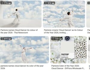
The choice made by Pantone in 2026 brings to mind floating clouds and the freshness of clean linen. Besides, it is an off-white with great potential that is meant to convey a feeling of space and calmness and thus goes well with pastels, can create a stark contrast with black, and can serve as a neutral groundwork for vibrant colour areas. To a large extent, this is a minimalist background that exists to let other colours have their say.
2. Teal
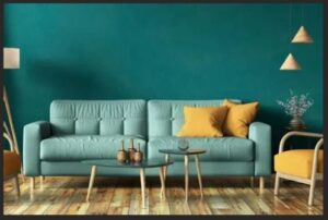
The reason behind WGSN’s decision to choose teal as the colour of 2026 is the reconnection with the earth. In fact, as a mix of green and blue, teal subtly refers to both land and water — a colour that speaks for both saving the planet and taking a break. A lot of designers attribute the rise of blue-green hues to their being comforting and versatile. Full rooms in teal, from the ceiling to the trim, are becoming popular as they give the impression to have been taken to a spa and thus, create relaxation.
3. Claret, Bronze Red and Garnet
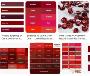
The trend deep and earthy reds are going to be strong seeds that will be nurtured to continue growing looks like from the berries and plums of 2025 onwards turning into more earthy and grounded tones. Basically, these colours are the ones that evoke terracotta, aubergine and aged wine and, at the same time, bring warmth and elegance to the table. When paired with natural materials such as wood and stone, they have the power to turn the interiors into warm and stylish ones.
4. Grey Ochre
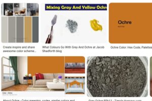
The walls of muted grey-ochre and off-white ceiling in this Georgian residence serve as a perfect canvas for the antique furniture and artwork to stand out. The designers pinpoint the rising popularity of the affectionate revival of the past with emphasis on the subtle and gentle-toned painter potteries of the seventies, old libraries, and rural sceneries–all mixed up in a present-day, layered style.
5. Ecru and Chestnut

Colour families that have similar undertones have been getting more and more common. The duo of Earthborn consisting of the creamy ecru and soft chestnut is a brilliant example of how tonal layering – lighter on top, mid-tone around the room, deeper shades on woodwork – can bring the richness of the depth without the need to overpower the senses. Additionally, mixing the matt finish of the walls with the satin one of the trim provides even more dimension.
6. Peach, Soft Browns and Cream
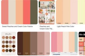
The trend for warm, blended neutrals is on the rise. The designer, Christian Bense, employs the use of mild browns along with peach-cream ceilings and various textures – from cream drapes to rust-coloured upholstery – to come up with welcoming, comfortable spaces that look like they’ve been lived in. The “comfort colours” that are beige now have gone beyond simple beige and have embraced richer taupes and more nuanced mid-tones as well.
7. Mineral Blue
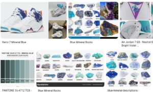
The trend towards nature-inspired colours is still there and such are the choices for the interiors. Mineral blues, being soft, airy, and reminiscent of the sky and the sea, have the ability to bring peace and calm into any room. Together with the green accents or natural elements, they become the perfect enhancers of the sense of natural equilibrium.
8. Sage and Jade Green
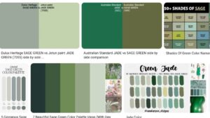
The two, sage and jade, have been the favourite of designers for quite a long time now, be it the Georgian homes or modern minimalism. These greens, which are based on the symbolism of renewal and harmony, might be used to subtly show off the architectural details or to establish a tranquil backdrop. Birdie Fortescue, the designer, utilised Norfolk landscapes in her recent collaboration to portray the comforting, everlasting colour scheme.

